Nuli - self-directed redesign driven by my passion for this app!
Empowering Taiwanese Women to Step Into Fitness Space with Straightforward UI
Contributions
Concept Ideation Product Designer 1 month
User Research
Wireframing
Prototyping
Interaction Design
Visual Design
User Testing
I conducted a thematic analysis of 40+ users’ comments on an online forum, recreated the app’s UI/UX from scratch, and refined its UI/UX design.
Role
Timeline

How it Started
As a Taiwanese woman who loves strength training, I was curious about how local fitness apps supported users like me. I started exploring Nuli not only as a designer but also as a potential user. I combined my perspective with insights from fitness forums (girls/weight loss/strength training boards), where I discovered a striking duality:
Many users loved Nuli’s short, home-friendly workouts and motivational progress photos.
But at the same time, they expressed frustration over generic menus, complex UX, unclear pricing, and lack of human nutrition support.
This tension resonated deeply — the app had the potential to empower, but parts of the experience created friction and mistrust.
The Problem
Despite strong adoption, Nuli faced friction in user trust and experience:
Loved: quick workouts, progress tracking, and community features.
Frustrations:
Menus felt generic and inconvenient, living outside the app.
The UI was complex and tap-heavy, overwhelming for beginners.
Pricing was perceived as opaque with upsell pressure.
Lack of human nutrition support pushed users toward competitors.
These frictions undermined Nuli’s strengths in motivation and habit-building.
Research Insights
I analyzed posts across three onlne discussion Dcard boards (girls/weigh loss/strength training discussion), clustering insights into themes.
To ground the findings, I mapped users into Jobs-to-be-Done archetypes:
Busy office worker / new grad: wants a simple, daily plan, minimal decisions.
Budget-sensitive self-starter: wants trustworthy, low-pressure guidance.
Intermediate lifter: wants structured progression and form feedback.
Comparison shopper: will pick the app with transparency and human support.
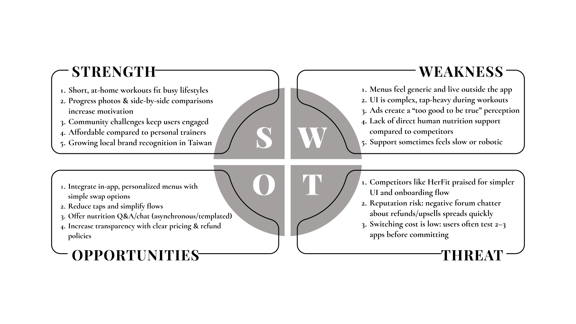
I also clustered research findings into a SWOT grid to identify strengths to build on, weaknesses to fix, and risks to mitigate:
Why It Matters?
Without addressing these gaps, Nuli risked:
Retention loss: beginners overwhelmed in week one.
Brand erosion: upsell complaints spread across forums.
Missed opportunity: nutrition is central to results, but felt “outsourced.”
Design Opportunities
From thematic analysis and SWOT synthesis, I defined 5 opportunity areas:
Menus feel generic: Add light personalization (calories, cuisine, meals/day) and integrate into-app.
UI/interaction complexity: Streamline with auto-advance, hands-free workouts, and a single “Today” plan.
Trust, pricing & refunds: Transparent packages, plain-language refund policy, expectations checklist.
Human touch in nutrition: Asynchronous nutritionist Q&A and templated food swaps.
Support & onboarding: In-app help center, clearer onboarding preview, faster SLA for support.
Prioritization Plan
Given a 1-month timeline and limited resources, I focus on improvements that:
Directly impact retention and trust (critical for survival in a competitive market).
Can be executed largely within design & product scope, without requiring major new org structures (e.g., hiring nutritionists).
High Priority (Focus Now):
UI/interaction complexity: Key barrier to retention; solvable with design iterations.
Menus feel generic: Nutrition is central to user goals; in-app menus increase perceived value.
Trust, pricing & refunds: Fast wins through clearer flows, reduces reputational risk.
Medium Priority (Plan Next):
Support & onboarding: Important, but requires ops + support team alignment; roadmap candidate.
Lower Priority (Future Expansion):
Human touch in nutrition: High value but resource-intensive; better suited as a phase-two initiative.
Design Solution
Based on this prioritization, I focused on improving the app experience first — reducing daily friction and rebuilding trust — before tackling people-intensive services.
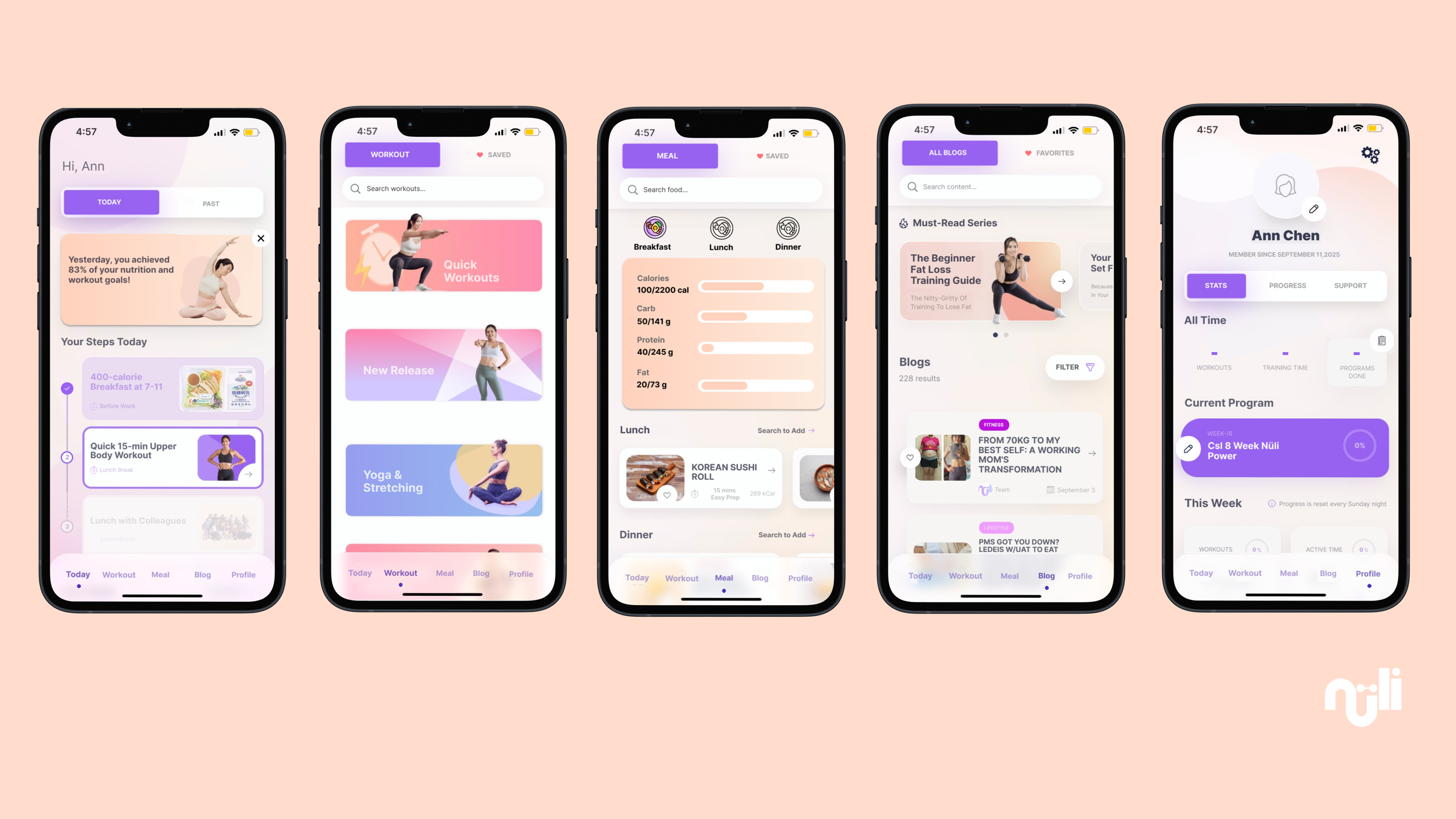
Simplifying Daily Flow, I focus on:
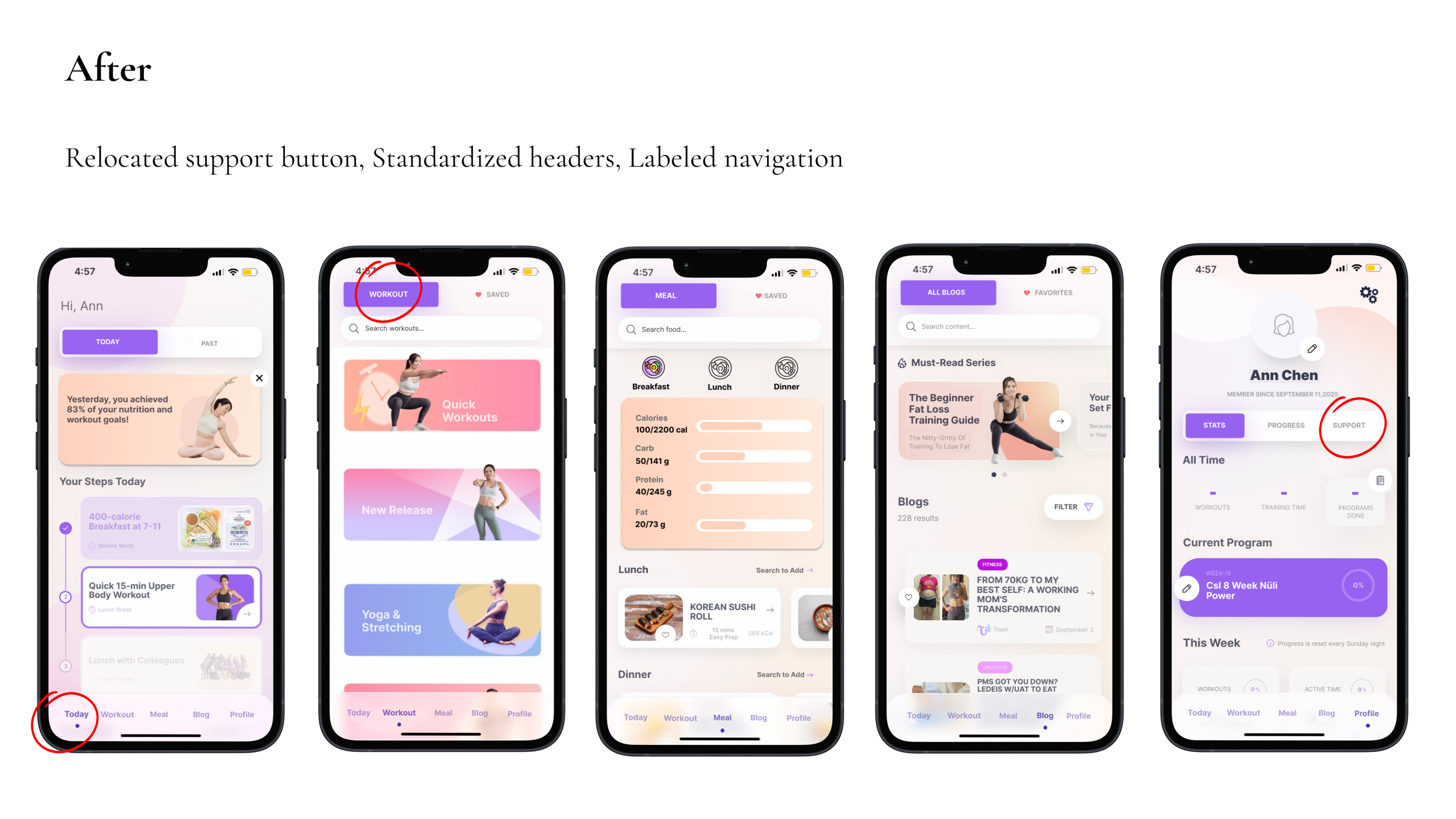
For the “Today” page: simplified the layout by combining workouts and meals into a single chronological sequence.
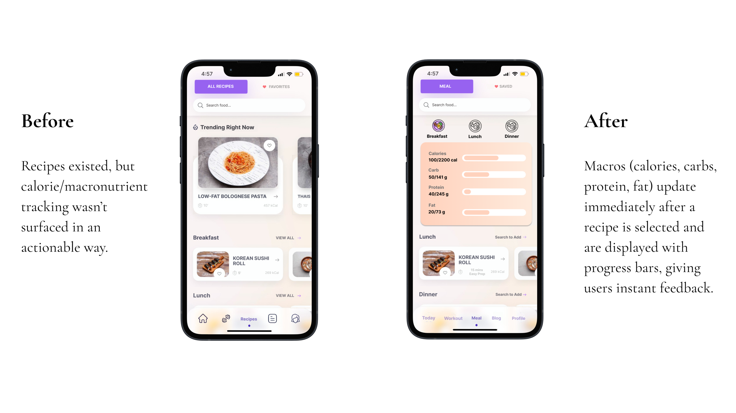
For the menu page, personalized in-app menus with macro tracking.
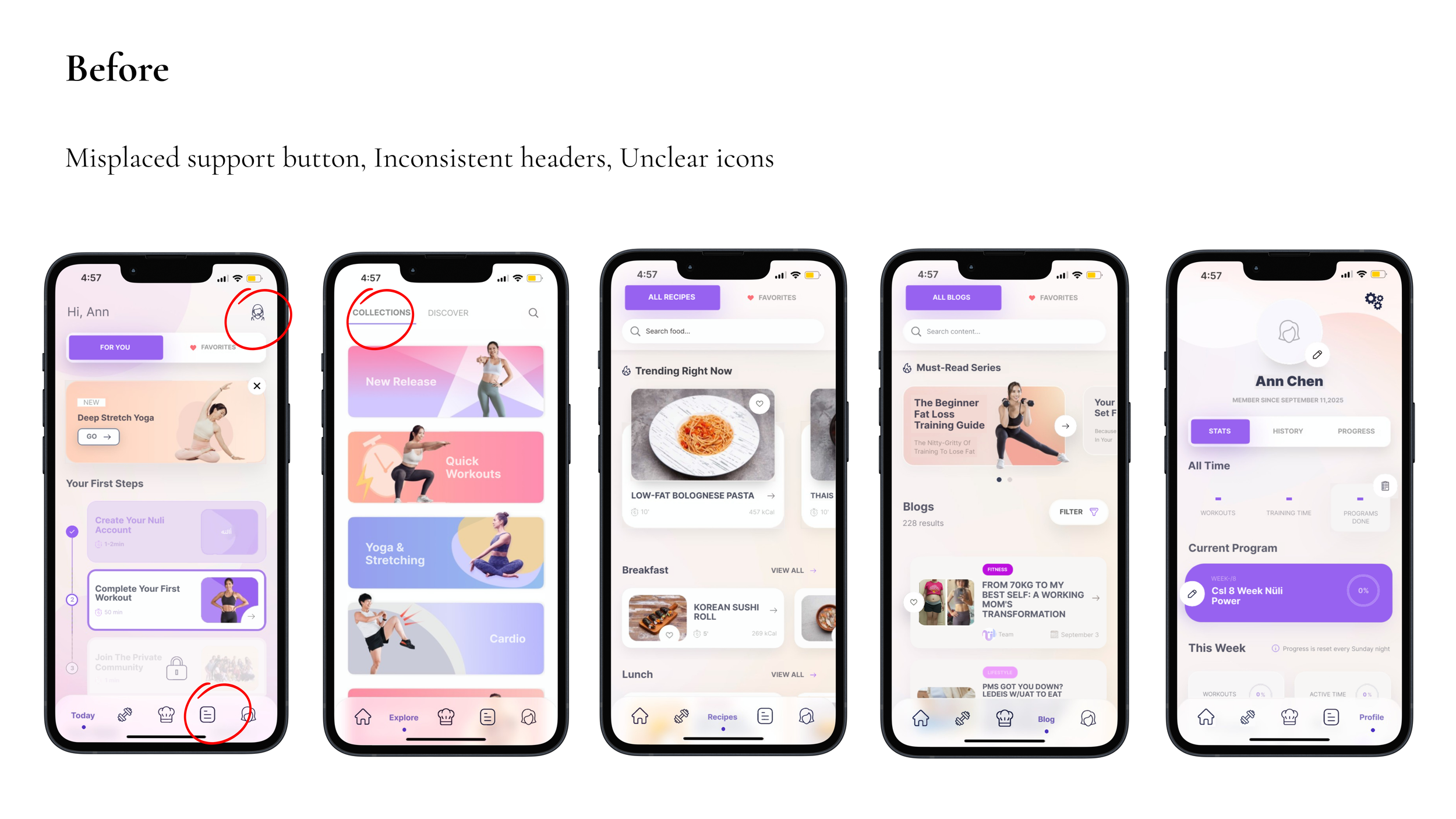
For the customer support button, move it to be on the profile session to reduce the complexity of the interface and to align with users’ expectations.
For icons in the navigation bar, replace them with words (As an user suggested “I don’t know what the icons in the navigation bar represented when I first logged in and got very confused decided to quit it“).
For the the header sections, I redesigned the pages so that the header sections (like the workout page header) follow the same structure, style, and placement rules as the rest of the app. This creates a unified visual identity across all screens. The redesign ensures that navigation elements, titles, and action buttons are positioned consistently, which makes it easier for users to understand the layout and reduces cognitive load.

Impact
To validate the redesign, I tested interactive prototypes with 5 Taiwanese female peers who represented my target user groups (busy office workers, new grads, and self-starters).
Key Outcomes
Onboarding streamlined: reduced setup from 6 screens to 3. Testers started workouts 2.1x faster and described the flow as “straightforward.”
Navigation clarity improved: replacing icons with text labels increased successful navigation from 40% → 100%. One tester said: “I understood where everything was without guessing.”
Retention proxy: simplified “Today” page encouraged daily use. Testers described it as “finally one place to check everything, not scattered around.”
Personalization win: In-app menus with macro tracking made users feel recognized: “It feels like the app knows me, not just any random user.”