Make a learning
impact today
Hire Ann as a learning experience designer!
Today’s Special (How’s Ann Special?)
Ann’s Learning Design Example
As part of the group redesigning the How People Learn course in the Teaching and Learning Lab Practicum, in the beginning, Ann focuses on developing two prototypes of the course—one using Articulate 360 and the other in a blog format.
Working Professionals Feedback on these two prototypes
“As someone who wants to learn about learning theory but isn’t particularly interested in reading dry academic material, I find edutainment-style blog posts a sustainable way to maintain my interest in learning over the long term.”
Chris C

“I really like the Articulate 360 platform with its flashcard design for learning those learning theories. It provides both convenience and depth. When I don’t have much time, I can quickly skim through the key concepts using the flashcards. When I do have more time, I can read the detailed explanations to understand how each concept can be applied in the workplace.”
L Huang

“I’m someone who reflects a lot on the way I learn. I find the explanations of those theories on the Articulate platform easy to read and helpful for my own reflection.”
T Fang

Learn more about Ann’s learning design process
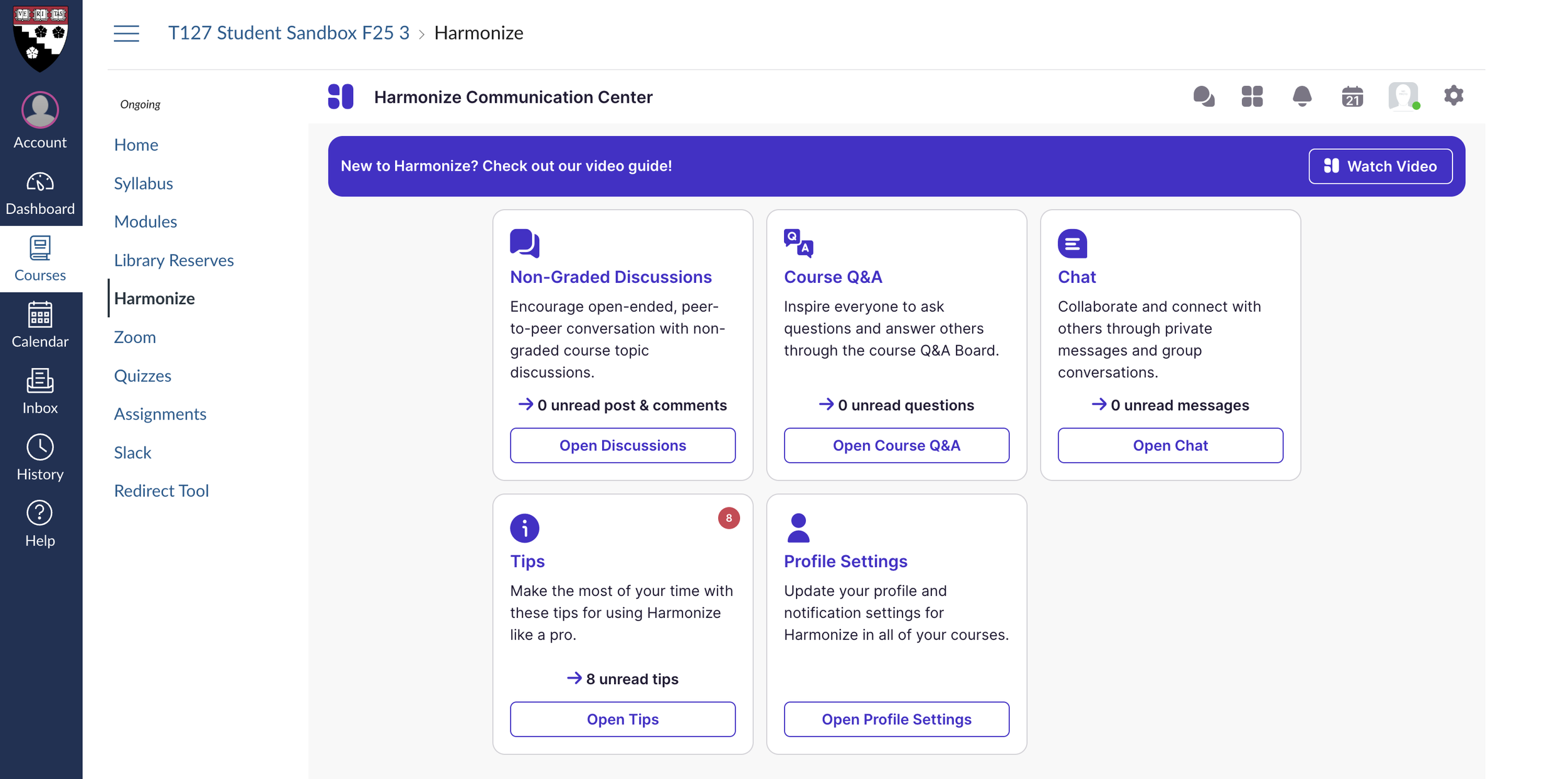
Before diving into the design process, it’s worth noting how the course platform evolved. In the early stages, Ann developed two distinct prototypes, one in Articulate 360 and one in a blog-style format, to explore different approaches to delivering learning theory to busy working professionals. However, after presenting these prototypes and discussing trade-offs with fellow learning experience designers, the team collectively decided to launch the final course on Canvas. Canvas offered several advantages that aligned more directly with the course goals: it provided stronger support for modular weekly flows, seamless integration with tools like Harmonize, and a more scalable structure for iterative faculty-student interaction. This shift allowed the redesigned course to maintain the visual clarity and flexibility of the prototypes while situating the learning experience within a platform.
Step 2: Understanding learners and develop user Persona
We conducted interviews with working professionals from both the U.S. and Asia, as well as expert interviews with learning designers from MIT and Harvard who have experience creating learning experiences for working professionals, to develop a deeper understanding of the learners we’re designing for.


Step 4: Proposing an Intended Educational product
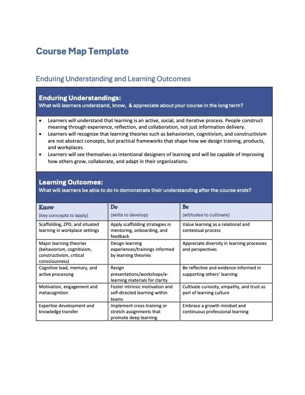
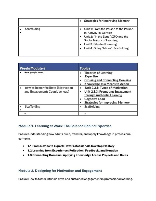
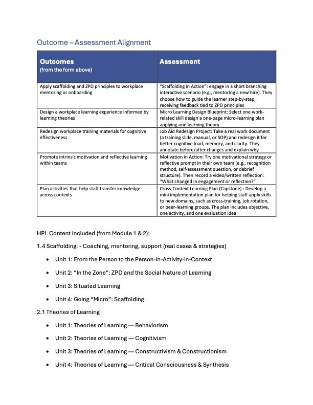
In this step, we translated our research insights and project charter into a concrete vision for the learning experience. This involved drafting the course’s intended educational product. We calrify what learners should understand, be able to do, and value by the end of the program. We created a structured course map that outlined enduring understandings and learning outcomes, then aligned those outcomes with meaningful assessments designed to measure applied learning in authentic workplace contexts. This alignment ensured that every assessment supported the development of specific competencies, such as scaffolding in mentoring relationships, applying cognitive learning theories, and designing workplace learning experiences.


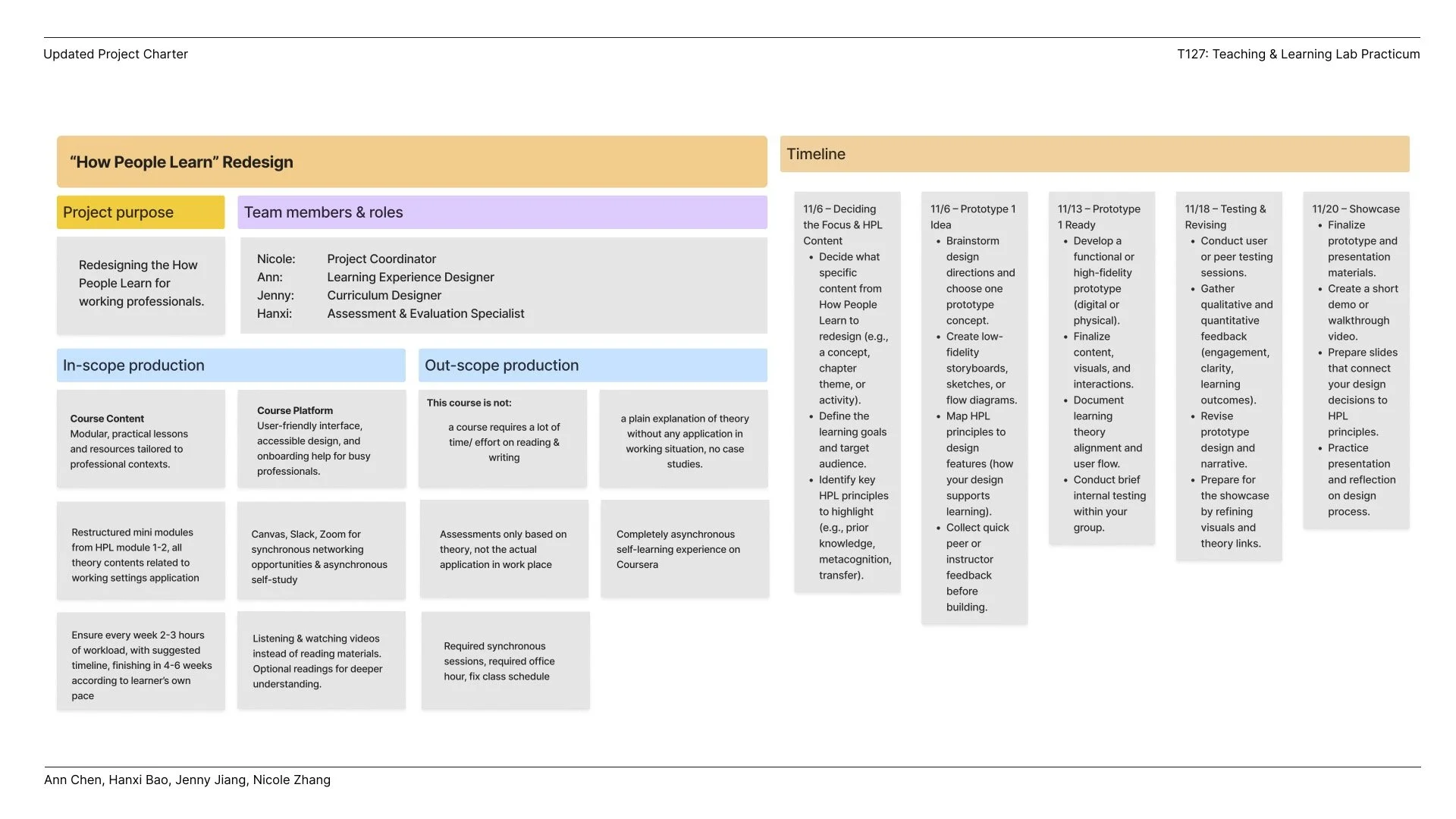
Step 3: Developing a project charter
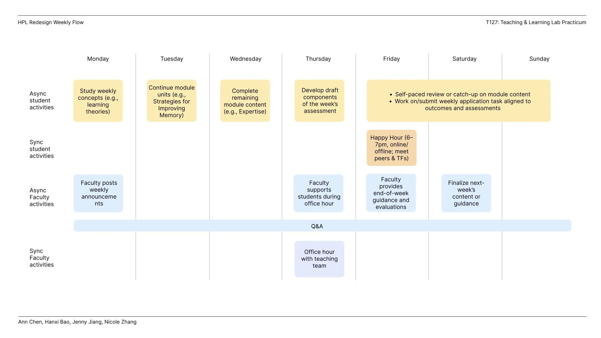
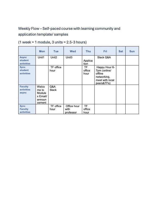
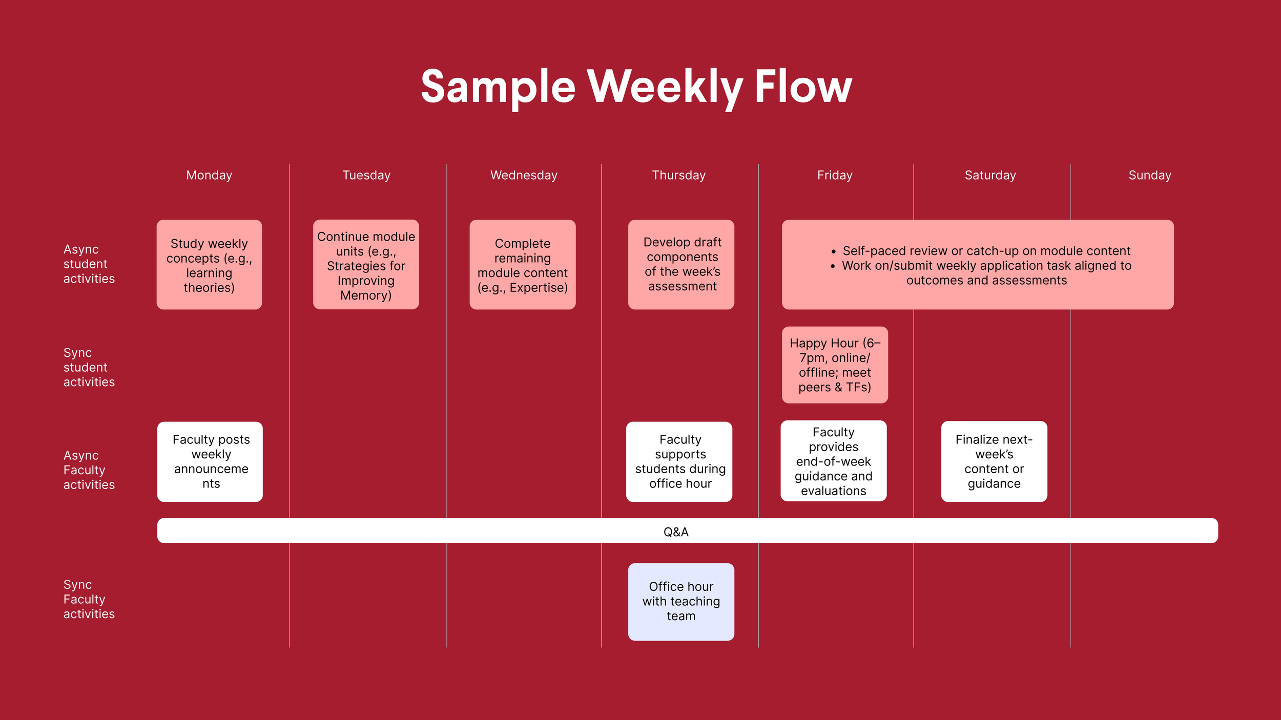
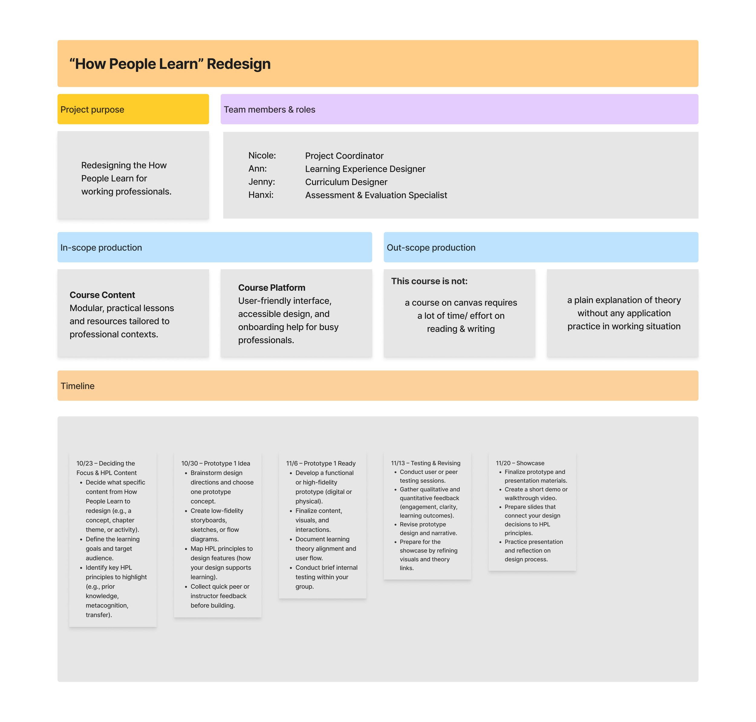
In this phase, we synthesized insights gathered from professional learners and create a project charter. The charter articulated the course goals, target learner profile, team roles, and specific in-scope and out-of-scope components to ensure clarity and feasibility. It also established a detailed development timeline and weekly learning flow, mapping asynchronous and synchronous activities for both students and faculty.
As part of the gallery walk, we shared a sample Canvas course page that demonstrated the streamlined navigation, intentionally simplified layouts, and just-in-time resources that help learners stay oriented and focused.
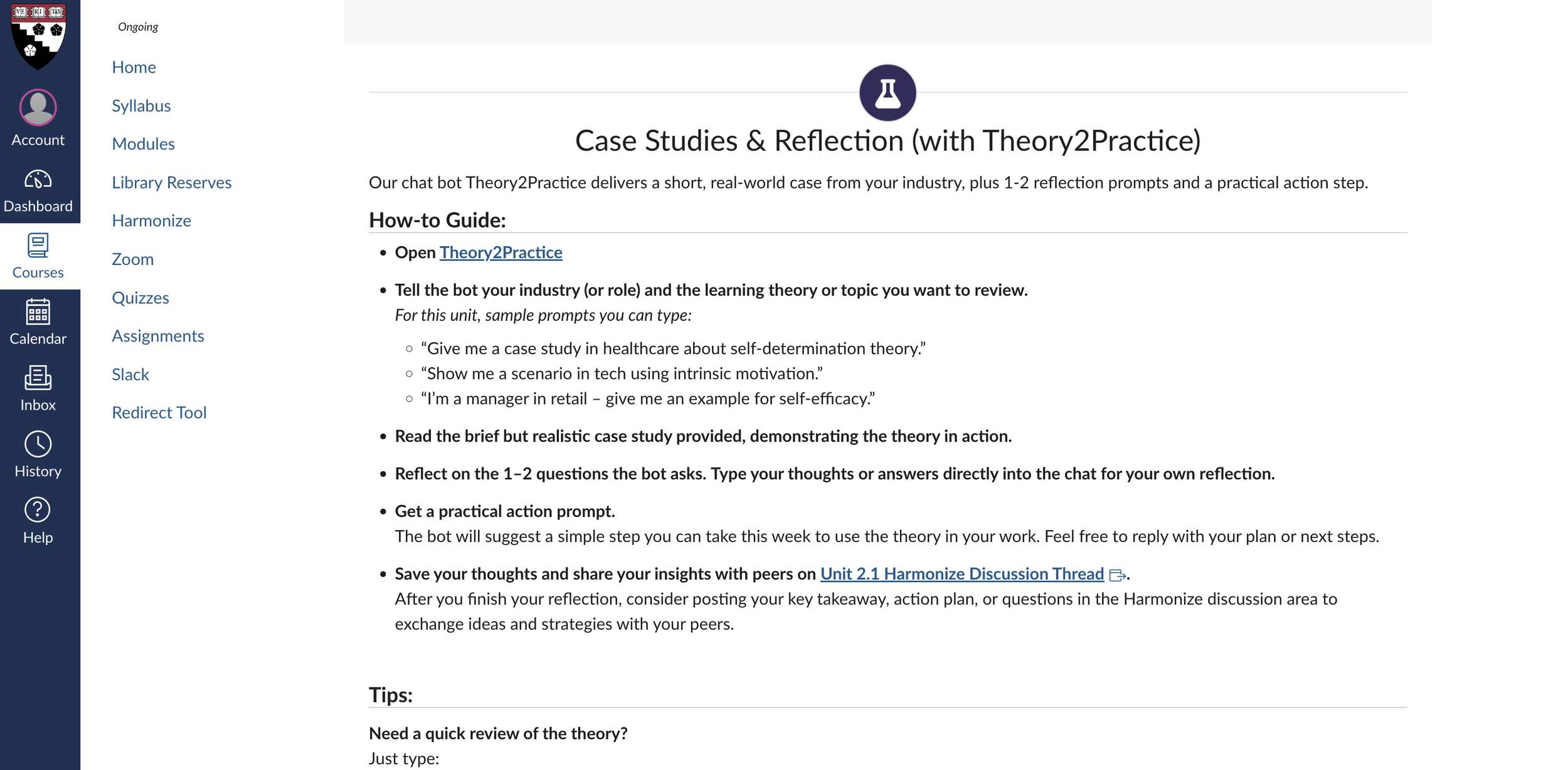
We also showcased our redesigned homework structure, which now centers on domain-specific case studies generated through the customized “PingPong” chatbot. This feature allows learners to enter their professional context and receive a tailored scenario that challenges them to apply course concepts directly to their workplace realities.
We further presented the Harmonize discussion sessions, which provide space for learners to share their case analyses, exchange feedback with peers across industries, and build a supportive professional learning network. This component emphasized the social and collaborative dimensions of learning while honoring diverse perspectives and experiences.
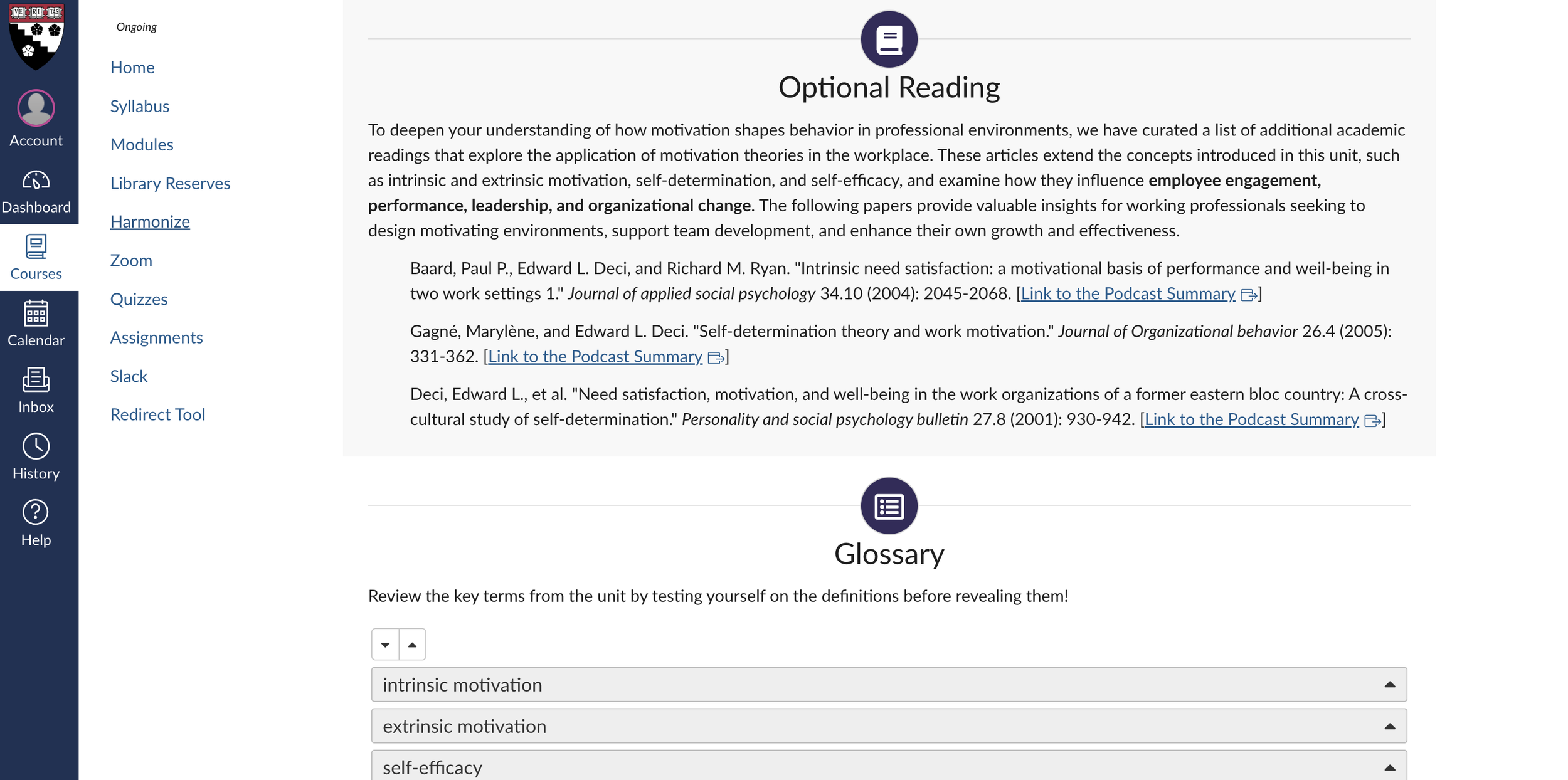
Finally, we included a curated set of optional readings that were also transformed into podcast-style audio using NotebookLM, recognizing that working professionals often have limited time for traditional reading. Converting these materials into an accessible, conversational audio format allows learners to engage with course concepts during commutes or downtime. These resources were intentionally selected to illustrate how learning science principles show up in everyday workplace scenarios, while also offering multiple flexible modes of engagement aligned with adult learners’ preferences.
Together, the gallery walk artifacts illustrated a cohesive, flexible, and workplace-anchored learning experience designed to meet professionals where they are while expanding what they can do with learning science in practice.
Step 6: Iterating and Refining the Learning Experience
Based on Expert and Learner Feedback
After presenting the redesigned course in the gallery walk, our team entered a critical refinement phase informed by feedback from working professionals, peer learning designers, and one of the original How People Learn course designers, Professor Matthew L. Miller. This step ensured that the course not only demonstrated strong pedagogical grounding but also aligned with the real needs, contexts, and expectations of professional learners.
Instructor and Expert Insights
During a design review conversation with Professor Miller, several key insights helped reorient aspects of the course:
Start with learning theories, not developmental psychology. For busy professionals, beginning with applicable and practice-oriented concepts provides faster entry points and increases perceived relevance of the course from day one.
Shift toward micro-learning. Professor Miller highlighted that our materials were becoming more concise and modular, which aligns with the way working professionals prefer to learn—through shorter, tightly scoped learning units that reduce cognitive load.
Introduce dual-faculty weekly roles. He proposed a “primary + secondary faculty” structure each week. This reduces scheduling burdens, distributes workload more evenly across instructors, and ensures flexibility without sacrificing continuity or quality of instruction.
Anticipate the future of professional learning. Our discussion explored whether learning may continue shifting toward TikTok-style short videos, and how that compares to learning with a chatbot. The consensus:
short videos = efficient practice,
bots = reflective interaction,
and both modalities can coexist meaningfully in the course.
Maintain real-world exemplars as anchors. The current HPL course includes workplace-relevant examples for every concept. We incorporated this into our redesign by embedding concrete industry scenarios, both in cases and in optional multimedia resources.
Commit to a device-neutral experience. Professional learners frequently switch between phones and laptops. Our design adjustments began moving toward a seamless cross-device experience, minimizing layout breakpoints and ensuring activity types translate cleanly across devices.
Navigate the “uncanny valley” of AI-mediated learning. We acknowledged that while AI-driven tools (like the PingPong case-generator) are powerful, learners still value human presence. This reinforced the importance of maintaining meaningful human-faculty interactions throughout the course.
Working Professional Learner Insights
Clarified “why this matters” for working professionals. Working professionals told us they need to know upfront how each concept helps them solve real problems at work. Several participants shared that without a clear link to their day-to-day responsibilities, they tend to “tune out” academic material. Adding explicit workplace relevance helped them immediately see the payoff for investing their limited time.
We explicitly added the rationale behind each major course objective, connecting learning science concepts to challenges professionals face, such as mentoring, onboarding, decision-making, and designing workplace learning.
Revised learning outcomes order. Professionals mentioned that they prefer to “start with the basics to get oriented” before being asked to apply or transfer ideas. Some reported feeling “lost” when application outcomes appeared before the core concepts. Reordering aligned the course with how they naturally build confidence as learners.
Based on feedback that the current ordering felt unintuitive, we re-sequenced outcomes from foundational to advanced application.Enhanced assessments. Professionals expressed that having only a large case study felt “high-pressure” and that they wanted small checkpoints to confirm they were on the right track. Quick quizzes give them immediate feedback, reduce anxiety, and support their preference for fast, bite-sized validation as they learn.
We refined the assessment progression and explored adding quizzes in Canvas to better illustrate how learners would demonstrate applied competence in addition to the case study.Pagination and layout adjustments. Many working professionals said they complete coursework on “the subway,” “between meetings,” or “on their phone.” Long pages made it easy to lose their place or miss key content. Shorter, clearly divided sub-pages fit their on-the-go learning habits and made the experience feel more manageable. Reviewers highlighted that some Canvas pages felt too long.
We introduced clearer sub-pages, reducing scrolling and improving cross-device navigation.
Step 5: Showcasing the Redesigned Learning Experience Through a Gallery Walk
In this step, we brought our redesigned How People Learn course to life by presenting it in a gallery walk format tailored for working professionals. Our goal was to make the revised learning experience visible, tangible, and easy to evaluate across multiple dimensions of flexibility, relevance, and applicability.
We highlighted a weekly flow that supports busy professionals by integrating both synchronous touchpoints and asynchronous pathways, ensuring learners can engage meaningfully regardless of schedule constraints.
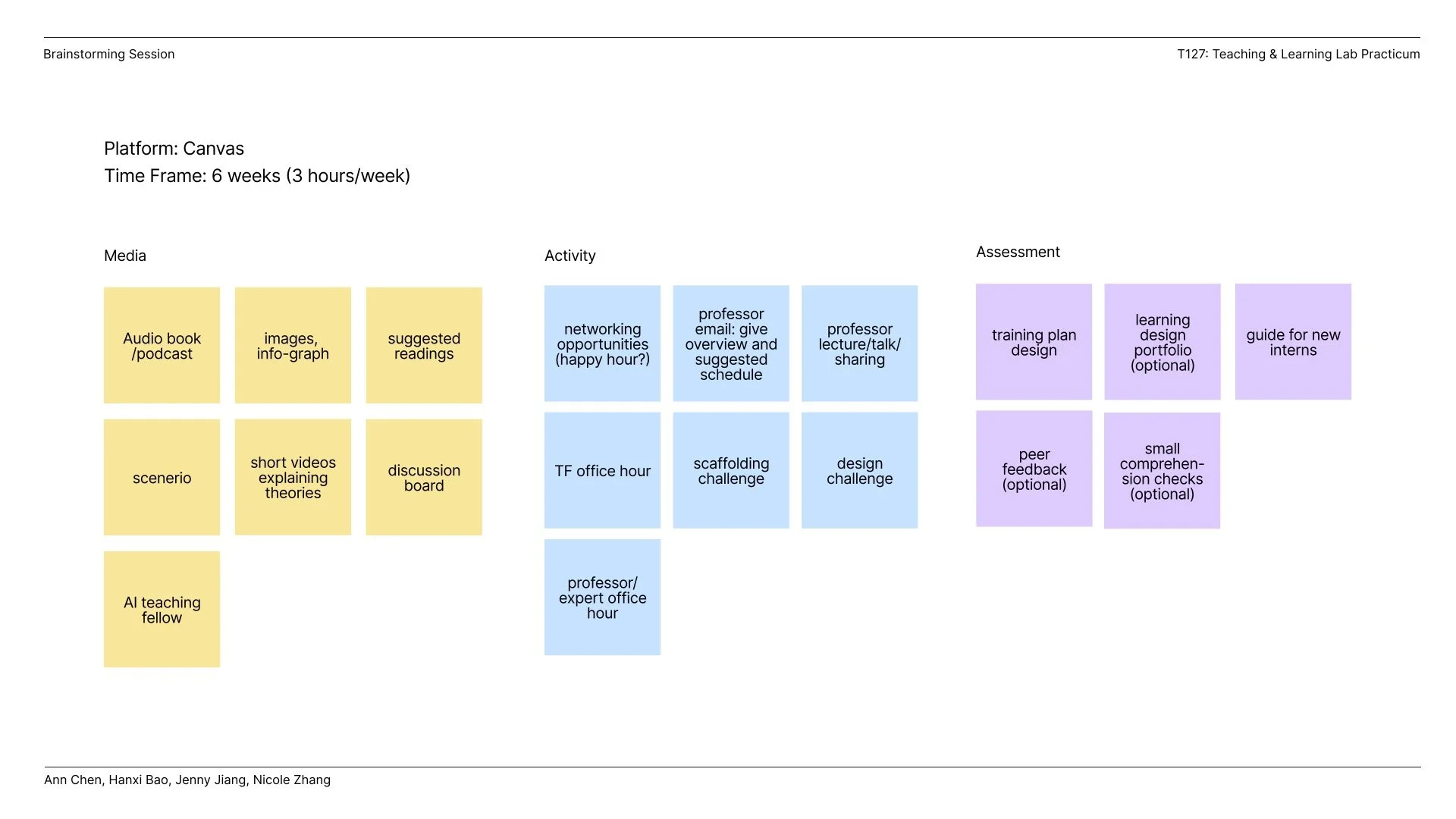
Step 1: Developing a rolling agenda and project charter for team collaboration
Since the design team is composed of learning experience designers from diverse backgrounds and this project requires close collaboration, we developed an agenda and project charter to align our expectations and roles.

Learning Experience Design Reflection Posts
-
Food for Thought 1 🍦: What do Harvard courses, product design, and BerryLine froyo have in common?
While revisiting Behaviorism, Cognitivism, and Constructivism (Ertmer & Newby, 2013) to explore ways of redesigning the program for working professionals, I was struck by how these classic learning theories map directly onto how we design products:
🍓Behaviorism: “Behaviorism focuses on the importance of the consequences of those performances”. In other words, reinforcement matters. Clear signals, feedback loops, and measurable outcomes drive adoption and habits. Think of onboarding flows as a series of small rewards that guide intentional user actions.
🍓Cognitivism: In 1950, psychologists began to de-emphasize behavioral models and shifted toward understanding learners’ conceptualizations of how learned information is organized. In other words, structure matters. People need information organized in ways that make sense. That’s why we invest in clarity in the user experience so users can focus on truly rationalizing how the product works and building lasting mental connections with the product.
🍓Constructivism: Different from behavioral and cognitive theory’s objectivistic point of view, constructivism argues that learners actively construct knowledge through experience, reflection, and interaction. Context matters. True understanding comes from hands-on experience. Real value is created when users experience and explore the product. Features should enable exploration and personalization not just scripted paths. That’s where deeper learning, and long-term loyalty, happen.
For a lighter take, as a BerryLine fan in Boston (their original frozen yogurt with mochi is the best!!), I like to think froyo captures these three theories in one cup!
🍓Behaviorism is that instant reward when the first spoonful of BerryLine makes you want more.
🍓Cognitivism is knowing which toppings and flavors fit together because you’ve learned the patterns.
🍓Constructivism is experimenting until you find your own perfect mix.Combining these theories, products, or even something as simple as froyo, don’t just deliver functionality. They teach. They reinforce behaviors and empower discovery. As product designers, we don’t just create products; we’re creating learning experiences for our users.
-
📍Food for Thought #2: Designing for Inclusion at Scale
I approached the redesign of the course for working professionals through a guiding design principle rooted in human–computer interaction: accessibility as a foundation for equity. Every design choice aimed to make learning human-centered for all learners, including those with visual, auditory, motor, and cognitive differences.
✨ Accessibility by Design (aligned with WCAG 2.1 AA, ADA, and Section 508):
❗Perceivable: Added captions, transcripts, and high-contrast visuals with descriptive alt text for all media.
❗Operable: Ensured full keyboard navigation and logical tab flow.
❗Understandable: Simplified complex educational content and introduced consistent navigation patterns.
❗Robust: Verified compatibility with WAVE web accessibility evaluation tools as well as NVDA and VoiceOver using semantic HTML to ensure assistive technology support.
But accessibility doesn’t end with interfaces and it extends to how people participate, express themselves, and create meaning online. That belief also guided my earlier work at the AI for Social Good Lab, where I led a study on how visually impaired YouTubers navigate content monetization. I interviewed 12 creators across 4 continents and found innovative strategies for visibility and income, from reframing disability representation to leveraging YouTube as a credibility portfolio for offline opportunities.
Both experiences reaffirm a core belief: Inclusive design is not just about compliance. It is about creativity, empathy, and expanding what participation looks like in digital spaces.
The HCI research community has long explored how creators from marginalized communities, including LGBTQ+, Black, and transfeminine creators (Kingsley et al., 2022; Rodriguez, 2023; Harris et al., 2023; DeVito, 2022), as well as creators with disabilities (Choi et al., 2022; Borgos et al., 2019), navigate visibility, representation, and accessibility. An MIT research group I engaged with during a PhD interview had been exploring the limitations of existing web accessibility standards, particularly their tendency to offer only basic text or table alternatives for data visualizations, which restricts non-visual data exploration (Zong et al., 2022).
If you’re interested in diving deeper into this topic to design for equity and inclusion, I highly recommend checking out these incredible works and ongoing research in this space! -
📍Food for Thought #3: Learning Isn’t Just Data: What Human-Centered AI Taught Me
Over the past few weeks, I’ve had a few coffee chats with learning designers across different industries and have learned how generative AI is increasingly being used to analyze learner performance and support learning design systems. I also immersed myself in both learning design and reading human-centered AI research. These chats and reading are shifting how I think about my work as a learning designer. Recent human-centered AI research work, spanning passive sensing, digital wellbeing, AI ethics, and context-aware systems, highlights something fundamental:
✨ Learning is not just cognitive. It’s emotional, contextual, and deeply human.
As a learning designer, I often think about engagement, motivation, feedback, and learner support. But human-centered AI research made me rethink how we understand learners in the first place, and what ethical responsibilities we carry when designing “intelligent” or data-driven learning systems.
Here are two key reflections that I’m taking forward:
👾 1. Interpretation matters more than data!
Research shows that AI can easily misinterpret human behavior when it’s divorced from context (Zhang et al., 2024).
For learning design, this means:A drop in LMS activity does not always equal disengagement.
A spike in late-night studying may reflect stress, caregiving responsibilities, or limited access and might not be a lack of discipline.
Behavioral analytics must be paired with empathetic, contextual understanding of learners’ lived realities.
👾 2. AI should coach, not control!
Systems like GLOSS (Choube et al., 2025) and Trucey (Duddu et al., 2025) demonstrate that AI works best when it supports reflection, not when it dictates decisions.
For learning:
AI tutors should help learners understand their habits, not label them as “good” or “bad.”
Reflection prompts can help learners make meaning from their own behavior — fostering metacognition.
The goal is empowerment, not surveillance.
-
📍Food for Thought #4: Designing in the ZPD — Why Support Matters More Than Structure
During the Deliver module, I found myself returning repeatedly to the learning-science concepts we explored in HPL, especially the Zone of Proximal Development (ZPD) and its implications for designing learning experiences. Seeing how people interacted with our redesign of HPL for working professionals in gallery walk made the ZPD feel directly relevant: the goal is to provide the right amount of support without overwhelming or under-supporting the learner.Feedback from the Gallery Walk made this even clearer. Some of our text was still too dense, which risks pushing learners outside their ZPD by creating unnecessary cognitive load. Our “suggested weekly flow” also came across as more rigid than intended; instead of acting as a scaffold, it felt like a mandate, something that could actually hinder learners who need flexibility. Moreover, participants also wanted us to name the pain points of working professionals more explicitly and to build in more networking opportunities.
Overall, the Deliver module reinforced that our design should keep working professionals within a productive ZPD, which should be supported but not pressured and guided but not constrained. These insights will continue to shape how we refine our Capstone.
-
When I first joined the Teaching and Learning Lab Practicum to redesign How People Learn for working professionals, I wanted to better connect learning theory to authentic design decisions, build confidence working within institutional platforms, and collaborate effectively across disciplines. This project stretched me in exactly those ways.
I indeed came in with four identities: visual designer, computer scientist, researcher, and aspiring learning experience designer. This project became the place where all four had to show up at once and then negotiate with each other.
Looking back on the full arc from early prototypes to the gallery walk and refinement phase, I see this project less as “building a course” and more as learning how to design a living system: one that responds to real constraints, real people, and a rapidly changing landscape of AI-mediated learning.
My visual design background still shapes how I make information clear and inviting, but I now see aesthetics as a means of supporting cognitive clarity and accessibility rather than an endpoint in itself.
My AI/CS training empowered me to explore tools like LLM-based audio generation and AI-driven case creation, but I now approach these technologies with a more critical, ethical, and learner-centered mindset.
My research grounding in HCI reminded me to treat learner feedback, expert insights, and platform limitations as meaningful data, not barriers, to guide the design forward.
Most importantly, this project taught me to view learning experience design as an ongoing dialogue: between theory and practice, between technology and humanity, and between what learners say they need and what they actually experience. It’s a practice of continuous listening, refining, and aligning design decisions with the lived realities of the people we serve. Bringing together my backgrounds in art, computing, and research, I’m learning that great learning design isn’t about choosing one identity, and it’s about bringing them together to create experiences that truly serve learners. -
Introduction and Project Overview
In the Teaching and Learning Lab (TLL) Practicum, I worked as part of a design team tasked with redesigning the How People Learn (HPL) course for working professionals. Our goal was to create a flexible, workplace-anchored learning experience that made learning science accessible, relevant, and actionable for busy adult learners.
This analysis “unpacks” the key instructional design decisions I made and how they were informed by course readings, learning theories, and the practicum’s enduring understandings:
Learning design is all about making choices.
If you do not design for someone, then you are designing for no one.
Constraints are good, up to a point.
Designers are human, designing for humans.
I focus on:
The audience and how it shaped my design choices.
The learning outcomes and their alignment with the redesigned experience.
The learning theories and instructional design models that guided our design process.
1. Audience: Working Professionals as the Primary LearnersThe core audience for this redesign is working professionals, who are often mid-career, balancing full-time jobs, families, and other commitments. From early in the project, I treated audience definition not as a formality but as a design constraint that would anchor every decision. This aligns closely with the enduring understanding, “If you do not design for someone, then you are designing for no one.”
To deepen our understanding of this audience, I helped conduct and synthesize:
Interviews with working professionals from both the U.S. and Asia.
Expert interviews with learning designers from MIT and Harvard who specialize in professional and executive education.
From these conversations, several patterns emerged:
Professionals have limited, fragmented time and often learn “on the subway,” “between meetings,” or “on their phone.”
They want to understand “why this matters” immediately. In other words, they want to understand how each concept helps them solve real problems at work.
Long readings and dense pages can feel overwhelming; they value micro-learning, clear structure, and quick feedback.
They care about practical application, especially in mentoring, onboarding, decision-making, and designing learning in their own organizations.
These insights directly impacted our design choices. For example:
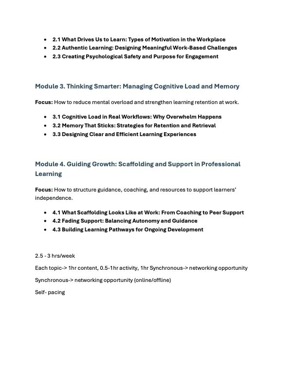
We prioritized short, modular learning units rather than long, monolithic modules.
We foregrounded workplace relevance in introductions, cases, and learning outcomes.
We advocated for device-neutral design and pagination choices that made it easier to learn on a phone.
We supported building low-stakes checkpoints, such as quizzes that offer only pass/fail options and appear only at the end of each module, to help professionals feel oriented and confident rather than anxious.
In short, the audience profile became a touchstone for evaluating whether our design choices were truly learner-centered instead of designer-centered.
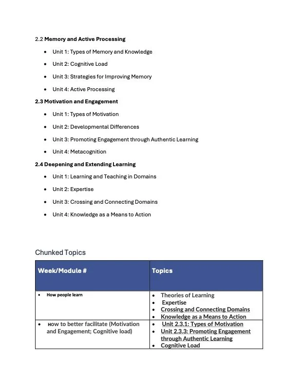
2. Learning Outcomes and AlignmentA central principle guiding the redesign was backward design, in which learning outcomes are established first and the instructional and assessment elements are then built deliberately to support those outcomes. In our redesign of How People Learn for working professionals, I played a key role in articulating, sequencing, and aligning these outcomes to the course’s learning experiences, assessments, and media choices.
Clarifying the Learning Outcomes:
Drawing from our project charter, faculty interviews, and working professional feedback, the course’s learning outcomes were refined and sequenced to move from foundation → application → transfer. The final outcomes were:
Outcome 1 Foundational Understanding: Learners will be able to explain key learning theories, including behaviorism, cognitivism, constructivism, and adult learning principles, in clear, workplace-relevant terms.
Outcome 2 Applied Analysis: Learners will be able to analyze workplace learning scenarios and identify where learning theory can clarify challenges or guide decisions (e.g., mentorship, onboarding, professional development).
Outcome 3 Reflection on Learning Practice: Learners will reflect on their own learning processes and develop a more intentional professional learning identity.
How the Redesigned Course Aligns with These Outcomes:
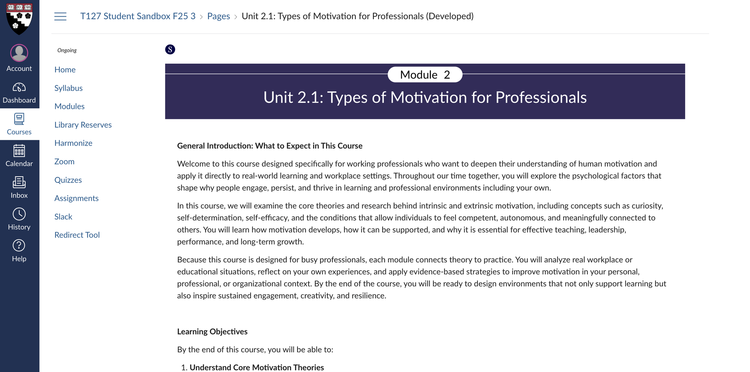
Outcome 1 (Foundational Understanding) Supported by Modular Concept Pages + Optional Audio + Micro-learning Structure
We intentionally designed short, modular Canvas pages that introduce each learning theory with:
a concise definition,
a workplace example, and
an optional reading section of reading that connects the definition to workplace application. To increase accessibility for busy professionals, we added podcast-style audio versions for these optional readings.
This aligns directly with cognitive load theory, reducing extraneous load while ensuring foundational concepts are available in a structured, digestible form.
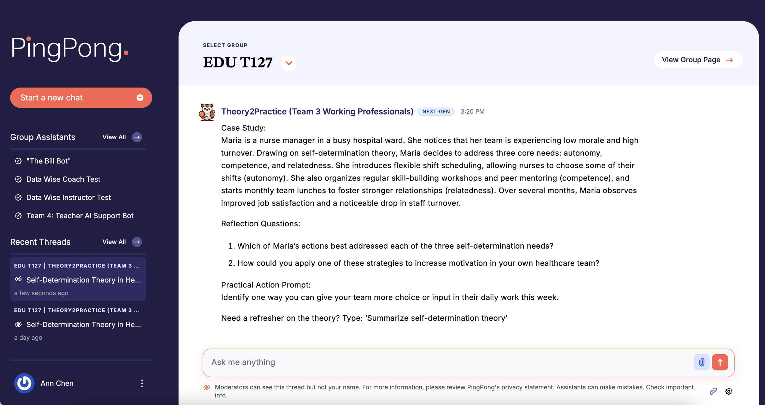
Outcome 2 (Applied Analysis) Supported by PingPong Chatbot–Generated Case Studies
To scaffold application, we integrated the PingPong case generator, allowing learners to enter their own professional contexts and receive tailored scenarios.
This supports Outcome 2 by enabling learners to:
analyze a workplace-relevant problem,
apply the week’s theory to interpret the scenario, and
articulate reasoning grounded in course concepts.
Because cases are personalized, learners see immediate relevance, which our interviews identified as essential for busy adult learners.
Outcome 3 (Reflection on Learning Practice) Supported by Harmonize Discussions
Throughout the course, learners reflect on their own learning habits, misconceptions, and evolving understanding of how people learn. This is supported by peer-sharing in Harmonize, which also offers valuable networking opportunities for working professionals.
3. Instructional Process and Theoretical Foundations
Our design process was guided by both instructional design models and learning theories studied in the practicum:
Applying ADDIE and Backward Design
Analysis: Through interviews, needs analysis, and collaboration on the project charter, we clarified learner needs, institutional constraints, and the scope of the redesign. I contributed to this phase by helping shape the rolling agenda and project charter that captured goals, roles, timelines, and in-scope vs. out-of-scope elements.
Design: I helped prototype learning sequences, outcomes, and assessments, always starting with “What should learners leave able to do?” in line with backward design.
Development: Development phase of ADDIE, I intentionally created two contrasting prototypes, one in Articulate 360 and one in a blog-style format, to test different ways of making learning theory approachable for working professionals. This dual-prototype approach allowed us to evaluate not only aesthetics and usability but also deeper pedagogical questions related to motivation, cognitive load, and learner autonomy. Working professionals told us in interviews that: they value clarity and efficiency, they do not want to read dense academic texts, they often learn in short bursts on mobile devices, and they vary significantly in how much depth they want at any given moment.
Given these constraints, we needed to test two fundamentally different instructional delivery metaphors:
Articulate 360 → “Interactive Micro-Learning”
Blog Format → “Narrative Edutainment”
Each prototype embodied a different design hypothesis about how adults prefer to learn theory.
Prototype 1: Articulate 360 (Interactive Micro-Learning): I developed an Articulate 360 prototype that presented each learning theory through a flashcard-style micro-learning interface. Each card offered: a bite-sized definition, a quick workplace example, and an option to “expand” for deeper explanation and citations. This design tested several pedagogical principles:
Cognitive Load Theory: Breaking content into discrete cards reduces extraneous load.
Learner Control: Professionals can skim or dive deeper depending on available time.
Feedback on the Articulate prototype revealed that professionals appreciated its clarity, modularity, and ability to scale complexity based on situational motivation. This validated micro-learning as a viable delivery mode.
Prototype 2: Blog-Style Format (Narrative Edutainment)
In contrast, the blog-format prototype drew from research on narrative engagement, informal learning, and the rising popularity of edutainment-style pedagogies.
This prototype used a conversational tone, storytelling techniques, real-world anecdotes, and visually clean long-form text. Its pedagogical hypothesis was different: If professionals feel emotionally connected to the material and see its relevance through story, they may be more motivated to persist with content that would otherwise feel abstract.
Working professionals responded positively to this prototype for different reasons: It felt human and “not academic.” Readers reported that they could imagine returning to the blog as a “resource,” not just a course page. This validated the idea that tone and narrative framing matter as much as content structure.Implementation: Although Canvas became the final platform, due to institutional compatibility and integration with Harmonize, the lessons from both prototypes directly shaped our Canvas implementation, the early prototypes informed our design language and content structure.
Evaluation: We gathered feedback from working professionals, peer designers, and course faculty (including Professor Matthew L. Miller), using that feedback to iterate on the flow, media, and assessment strategy.
Learning Theories in Practice
Several theoretical frameworks explicitly shaped our decisions:
Andragogy: We respected adults’ need for relevance and self-direction by clearly connecting each concept to workplace problems and giving them choices in how they engage (e.g., optional readings, audio versions, and flexible asynchronous work).
Constructivism and Social Learning: Harmonize discussions and peer feedback on cases reflect the idea that learners construct knowledge socially, not just individually. Learners see how others interpret theories in different industries, strengthening transferability.
Cognitive Load Theory and Multimedia Learning: The shift toward micro-learning, shorter Canvas pages, and a clear visual hierarchy in prototypes was driven by a desire to reduce extraneous load. In the Articulate prototype, for example, I used flashcards to separate key concepts from richer explanations, allowing learners to control the depth of their engagement.
Situated and Authentic Learning: By centering authentic, domain-specific cases generated via the PingPong chatbot, we invited learners to work with problems that feel like their own, rather than generic examples. This supports transfer and motivation.